PCAprincipal-component-analysiseigenvectorsSVDdimensionality-reductioncovariance-matrixscree-plotdata-sciencemachine-learningsklearn
AI
PCA Explained: From Zero to Mastery in One Deep Dive
TL;DR Here's the thing most tutorials miss: PCA is feature extraction, not feature selection. Feature selection picks a subset of your original features (keep gene #342, drop gene #7,891). PCA creates entirely new features — linear combinations of all your originals. The output features (principal components) are not interpretable as individual original variables.
Read this article as text (accessible version)
PCA — Dimensionality Reduction
·
3,900 words · 4 interactive labs · April 2026
principal component analysis
PCA Explained:
principal component analysis
PCA Explained:
From Zero to Mastery
in One Deep Dive
You've got 500 features and a model that's choking on them. PCA is the mathematical scalpel that cuts to the bone — keeping the variance, ditching the noise. Here's everything from eigenvectors to scree plots, with interactive simulations you can run right now.
Read the Deep Dive ↓ Open the Lab 📐 Σ = covariance matrix Σv = λv X = UΣVᵀ (SVD) z = (x−μ)/σ Table of Contents- Why PCA Exists: The Curse of Dimensionality
- Step 0: Standardization & Mean-Centering
- The Covariance Matrix Explained
- Eigenvectors, Eigenvalues & the Secret Sauce
- SVD: How PCA Is Actually Computed
- Choosing Components: Scree Plots & Variance
- Loadings, Limitations & Kernel PCA
- Getting Started: End-to-End PCA in Python
01Why PCA Exists: The Curse of Dimensionality
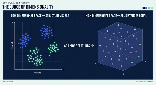
Imagine you're training a machine learning model to diagnose cancer from gene expression data. Your dataset has 200 patient samples and 20,000 gene features. Every classical distance metric becomes meaningless when you have that many dimensions — points that should be close are all equidistant. Your model overfits spectacularly. You can't visualize anything. Training takes forever. This is the curse of dimensionality, and it's not a minor inconvenience — it's the reason entire branches of data science exist.
PCA — Principal Component Analysis — is the most widely used response to this curse. Its goal is deceptively simple: find a lower-dimensional representation of your data that preserves as much of the original variance as possible. If 500 features can be faithfully represented in 10 dimensions, why suffer through all 500? The key word is "faithfully" — PCA doesn't randomly drop features. It finds the directions in your data space where the variance is highest, and projects the data onto those directions. Those directions are the principal components.
The result is a transformation — new coordinates for your data where the first axis captures the most spread, the second captures the next most, and so on, with each axis guaranteed to be orthogonal (perpendicular) to all others. This orthogonality is critical: it means your new features are completely uncorrelated, which is exactly what many machine learning algorithms want. PCA is used in face recognition (Eigenfaces), finance (factor analysis), bioinformatics, image compression, noise reduction, and as a preprocessing step before virtually every major ML algorithm.
💡 PCA vs Feature Selection — Don't Confuse ThemHere's the thing most tutorials miss: PCA is feature extraction, not feature selection. Feature selection picks a subset of your original features (keep gene #342, drop gene #7,891). PCA creates entirely new features — linear combinations of all your originals. The output features (principal components) are not interpretable as individual original variables. If you need to preserve feature names for regulatory or clinical reasons, PCA is the wrong tool. But if you want maximum variance compression with no domain knowledge required, PCA is unbeatable.
02Step 0: Why Standardization Can Make or Break Your PCA
Before you touch a covariance matrix or an eigenvector, there's a step so important that skipping it invalidates your entire analysis: standardization. PCA is fundamentally a variance-maximizing procedure. Whatever variables have the most variance will dominate the principal components. If you're analyzing housing data where "price" ranges from $100K to $2M and "number of rooms" ranges from 1 to 8, the price variable will completely overwhelm the room count, not because it's more important but simply because its numerical scale is larger.
Mean centering shifts each feature so its mean is zero: x' = x − μ. This places the origin at the center of your data cloud — necessary because PCA finds directions of maximum variance, and variance is measured from the mean. Standardization (Z-score normalization) goes further: z = (x − μ) / σ. It makes every feature have unit variance, ensuring all variables contribute equally regardless of their original measurement units.
There are exceptions. If all your variables are measured in the same units and scale (like pixel intensities in an image), standardization may not be needed or even desirable — it would artificially inflate the variance of nearly-constant features. And if you're doing PCA for data compression rather than exploratory analysis, you might intentionally preserve the original variance structure. But as a default, especially in mixed-unit datasets, standardize. Every time.
⚠️ Common Mistake: Standardizing Test Data SeparatelyWhen applying PCA to train/test splits, you must fit the StandardScaler on the training data only, then transform both train and test sets using that fitted scaler. Never fit_transform the test set — this leaks distribution information from the test set into your preprocessing, violating the train/test boundary and producing optimistically biased results in evaluation.
standardize.pyfrom sklearn.preprocessing import StandardScaler
from sklearn.model_selection import train_test_split
import numpy as np
# X is your feature matrix: shape (n_samples, n_features)
X_train, X_test, y_train, y_test = train_test_split(X, y, test_size=0.2)
# Correct: fit ONLY on training data, transform both
scaler = StandardScaler()
X_train_scaled = scaler.fit_transform(X_train) # learns μ and σ from train
X_test_scaled = scaler.transform(X_test) # applies same μ and σ to test
# Verify: training data mean ≈ 0, std ≈ 1
print(f"Train mean: {X_train_scaled.mean(axis=0).mean():.6f}") # ≈ 0.0
print(f"Train std: {X_train_scaled.std(axis=0).mean():.6f}") # ≈ 1.0
print(f"Test mean: {X_test_scaled.mean(axis=0).mean():.6f}") # ≠ 0 (that's expected)
03The Covariance Matrix: The DNA of Your Dataset's Relationships
After standardization, the next step is computing the covariance matrix — a symmetric matrix that encodes how every pair of features varies together. If you have p features, the covariance matrix Σ is p × p. The diagonal entries Σ_{ii} are the variances of each feature. The off-diagonal entries Σ_{ij} measure how features i and j co-vary: positive means they tend to increase together, negative means one increases as the other decreases, zero means they're uncorrelated.
Here's a physical intuition: imagine plotting weight vs height for a population. Both variables tend to increase together — tall people tend to weigh more — so their covariance is positive. Now imagine correlating shoe size with number of siblings — essentially zero covariance. The covariance matrix captures all these relationships simultaneously. For a dataset with 10 features, it's a 10×10 matrix with 10 diagonal variance entries and 45 unique covariance pairs. For 20,000 genes, it's a 20,000×20,000 matrix with 200 million entries — which is exactly why PCA computes eigenvectors rather than trying to reason about this matrix directly.
The covariance matrix of standardized data is actually a correlation matrix — all diagonal entries are 1 (each variable has unit variance), and off-diagonal entries are Pearson correlation coefficients between −1 and 1. This means that after standardization, PCA optimizes for correlation structure rather than raw magnitude. The principal components are directions in this p-dimensional correlation space that explain the most coordinated variation across all your features.
Σ = (1/(n-1)) × Xᵀ X (for mean-centered X) 📐 When the Covariance Matrix Is DiagonalIf the covariance matrix is already diagonal (all off-diagonal entries are zero), your features are already uncorrelated, and PCA would simply reorder your features by variance — no rotation needed. In practice, real datasets almost never have perfectly uncorrelated features. The whole power of PCA comes from finding the rotation that makes the transformed features uncorrelated. If your features were already uncorrelated, you'd just select the highest-variance ones directly.
04Eigenvectors & Eigenvalues: The "Secret Sauce" of PCA
Most people panic when they see the word eigenvector. Don't. The intuition is clean: an eigenvector of a matrix is a direction that the matrix simply stretches or shrinks — but doesn't rotate. When you multiply the covariance matrix by one of its eigenvectors, you get the same vector back, just scaled by a number called the eigenvalue: Σv = λv. The covariance matrix has p eigenvectors (one per dimension), and they are always mutually orthogonal — they point in completely perpendicular directions.
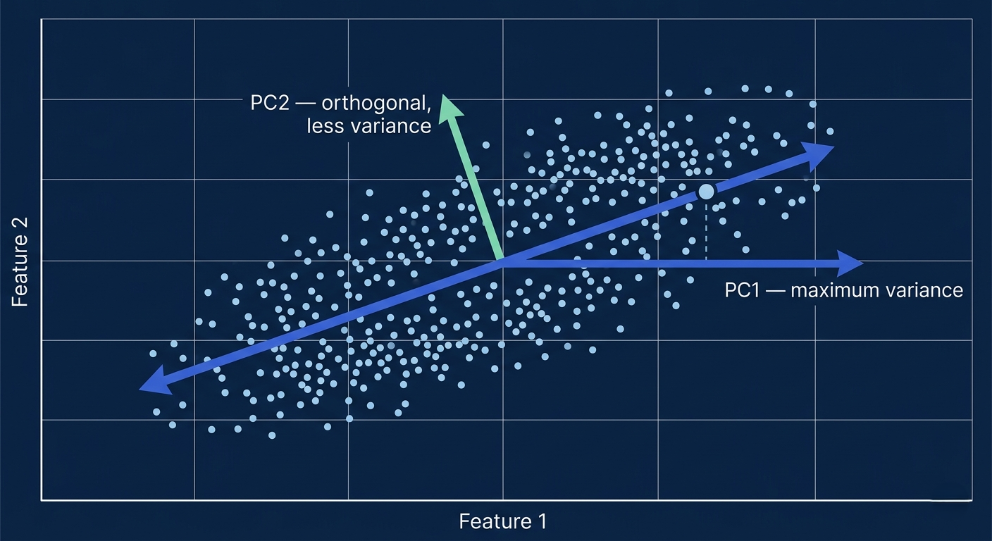
Here's the connection to PCA: the eigenvectors of the covariance matrix are the principal components. They define the directions of maximum variance in your data. The eigenvalue associated with each eigenvector tells you how much variance that direction explains — a larger eigenvalue means that principal component captures more of the data's spread. So if you sort eigenvectors by their eigenvalues from largest to smallest, you get PC1 (most variance), PC2 (second most), and so on.
Picture this: your 2D data looks like an elongated ellipse. The first principal component points along the long axis of the ellipse — that's the direction of maximum spread. The second PC points along the short axis — perpendicular to the first, capturing the remaining variation. In 2D this is easy to visualize. In 500 dimensions, the same geometric logic applies, but the covariance matrix's eigenvectors find these axes automatically through linear algebra.
🔮 Myth: An Eigenvalue of Zero Means the Feature Is UselessAn eigenvalue of exactly zero means that principal component explains zero variance — the data lies in a lower-dimensional subspace and that direction contains no information. More importantly, if any eigenvalue is zero, it means your features are perfectly collinear (some features are exact linear combinations of others), which also means your covariance matrix is singular (non-invertible). This is actually a diagnostically important result: it tells you that you have redundant features that are 100% correlated with combinations of other features. In practice, you get near-zero (not exactly zero) eigenvalues from floating-point noise, which you should still drop as they represent numerical artifacts, not real variance.
eigenvectors.pyimport numpy as np
# Compute covariance matrix and its eigenvectors manually
X = np.random.randn(100, 3) # 100 samples, 3 features
X -= X.mean(axis=0) # mean-center
# Covariance matrix (3×3)
cov = np.cov(X.T) # or (X.T @ X) / (n-1)
# Eigenvectors and eigenvalues of Σ
eigenvalues, eigenvectors = np.linalg.eigh(cov)
# Sort by eigenvalue (largest first)
idx = np.argsort(eigenvalues)[::-1]
eigenvalues = eigenvalues[idx]
eigenvectors = eigenvectors[:, idx]
# Explained variance ratio
evr = eigenvalues / eigenvalues.sum()
for i, (ev, evr_i) in enumerate(zip(eigenvalues, evr)):
print(ff"PC{i+1}: eigenvalue={ev:.4f}, explained_var={evr_i:.1%}")
# Project data onto first 2 PCs
X_pca = X @ eigenvectors[:, :2] # (100, 2) — dimensionality reduced!
05SVD: How PCA Is Actually Computed in Practice
If eigenvectors of the covariance matrix are PCA, why does scikit-learn use SVD? Because computing the covariance matrix explicitly requires O(p²) memory and O(p²n) time — for 20,000 gene features, that's a 400 million entry matrix. Singular Value Decomposition (SVD) factors any matrix X directly into three components: X = U Σ Vᵀ, where U and Vᵀ are orthogonal matrices (their columns are unit vectors at right angles to each other) and Σ is a diagonal matrix of singular values.
X = U · Σ · Vᵀ | singular values = √eigenvalues of XᵀXThe critical connection: the columns of V are exactly the eigenvectors of XᵀX (which is proportional to the covariance matrix), and the singular values are the square roots of the eigenvalues. So SVD gives you the principal components without ever explicitly forming the covariance matrix. Scikit-learn's PCA uses truncated SVD — it doesn't compute all p singular values/vectors, just the top k you request — making it feasible for high-dimensional problems where computing the full covariance matrix would be impossible.
For very large datasets (millions of samples), scikit-learn offers IncrementalPCA which computes PCA in mini-batches, and for extremely sparse data (like text bag-of-words), TruncatedSVD skips the centering step entirely (centering would destroy sparsity) and can handle matrices with billions of entries. These are the real-world variants of PCA that production data science actually uses.
If you're doing LSA (Latent Semantic Analysis) on TF-IDF matrices from text data, use sklearn.decomposition.TruncatedSVD, not PCA. Standard PCA centers the data before SVD, which converts a sparse matrix to dense (destroying your memory advantage). TruncatedSVD operates directly on the sparse matrix. The components are mathematically slightly different (not truly PCA since data isn't centered), but for NLP tasks the results are typically equivalent in quality.
06Choosing the Right Number of Components: Scree Plots & Variance Thresholds
You've run PCA on your 500-feature dataset and gotten 500 principal components back. Now you need to decide how many to keep. This is the most practical and often most debated step in PCA. There's no universally correct answer — it depends on your downstream task, your tolerance for information loss, and your computational constraints.
The scree plot is the most intuitive visualization tool: plot the eigenvalues (or explained variance ratios) on the y-axis against component number on the x-axis. You're looking for an "elbow" — the point where the curve bends sharply and eigenvalues level off into a relatively flat tail. Components before the elbow capture real structure. Components after it are likely noise. The term "scree" comes from geology — it's the rubble that collects at the base of a cliff, and the eigenvalue plot looks like a cliff with scree at the bottom.
The cumulative explained variance approach is more quantitative: plot the cumulative sum of explained variance ratios and choose enough components to reach a threshold (typically 90%, 95%, or 99%). A 95% threshold means your dimensionally-reduced data retains 95% of the information in the original dataset. For exploratory visualization, you typically project to 2 or 3 components regardless of explained variance. For machine learning preprocessing, 95% is a common choice. For dimensionality reduction before clustering, the optimal number often corresponds to the number of real clusters in your data.
⚠️ The Elbow Might Not Be Clear — Use Multiple CriteriaIn practice, the "elbow" in a scree plot is often ambiguous — is the elbow at component 5, 8, or 12? Use multiple criteria together: the scree plot elbow, the 90-95% cumulative variance threshold, and downstream task performance as a function of components. For production ML, you can even treat the number of PCA components as a hyperparameter and tune it with cross-validation. The "right" number of components is the one that optimizes your actual objective, not a fixed rule.
scree_and_variance.pyfrom sklearn.decomposition import PCA
import matplotlib.pyplot as plt
import numpy as np
# Fit PCA with all components to get full variance picture
pca_full = PCA().fit(X_train_scaled)
evr = pca_full.explained_variance_ratio_
cum_evr = np.cumsum(evr)
# Find minimum components for 95% cumulative explained variance
n_95 = np.argmax(cum_evr >= 0.95) + 1
print(ff"Components for 95% variance: {n_95}")
# Scree plot
fig, (ax1, ax2) = plt.subplots(1, 2, figsize=(12, 4))
ax1.plot(evr, 'o-'); ax1.set_title('Scree Plot (Eigenvalues)')
ax2.plot(cum_evr, 'o-')
ax2.axhline(0.95, color='red', linestyle='--', label='95%')
ax2.axvline(n_95-1, color='red', linestyle='--')
ax2.set_title('Cumulative Explained Variance')
# Now apply PCA with chosen n components
pca = PCA(n_components=n_95)
X_pca = pca.fit_transform(X_train_scaled)
print(f"Original shape: {X_train_scaled.shape} → PCA shape: {X_pca.shape}")
07Loadings, Information Loss & When PCA Fails
After PCA, the principal components are mathematical abstractions — linear combinations of your original variables. To interpret them, you use loadings: the correlations between the original features and each principal component. A large positive loading on PC1 for "height" and "weight" means PC1 represents "body size." A large negative loading for "rest heart rate" combined with a positive loading for "VO2 max" might represent "cardiovascular fitness." Loadings transform the math back into domain knowledge.
PCA is inherently lossy compression. When you keep 2 components from 500, you've discarded 498 dimensions of information. The discarded variance is the reconstruction error — the difference between your original data and what you can reconstruct from the reduced representation. This is acceptable if the dropped components are noise (you actually want to throw them away). It's problematic if important but low-variance signals live in those dropped components. Rare disease subtypes, for example, might be represented by a very small number of patients — low-variance signals that get dropped by standard PCA.
Most critically, PCA assumes linear relationships. It finds the linear combination of features that maximizes variance. If your data lives on a curved manifold — like a Swiss roll, a sphere, or the curved latent space of an image dataset — the linear PCA projection will mangle the structure. For non-linear dimensionality reduction, consider Kernel PCA (applies the kernel trick to PCA, implicitly mapping to a higher-dimensional space where linearity holds), t-SNE (great for visualization, terrible for preprocessing), or UMAP (better structure preservation than t-SNE, faster, works for preprocessing too).
🔮 Myth: More PCA Components Is Always BetterCounterintuitively, adding more principal components doesn't always improve downstream model performance — and can actually hurt it. The last few components tend to capture noise (variance that doesn't generalize). Including them can increase overfitting. A careful empirical test — cross-validating model performance as a function of the number of PCA components — often reveals an optimal point well below the 95% cumulative variance threshold. The best number of components is the one that maximizes validation performance, not the one that maximizes captured variance.
synthesisHow It All Connects: The Full PCA Pipeline
The complete PCA pipeline is a chain of mathematical steps, each building on the last. You start with raw data: standardize (remove scale bias), compute the covariance matrix (capture all pairwise relationships), find eigenvectors (discover the directions of maximum variance), sort by eigenvalue (rank components by importance), choose k components using the scree plot and cumulative variance, and project the data (compute the dot product of your standardized data with the top-k eigenvectors).
Everything connects: standardization ensures the covariance matrix represents correlation structure, not scale artifacts. The covariance matrix's eigenvectors become the principal components because eigenvectors are directions the matrix doesn't rotate — they're the natural axes of the variance structure. SVD gives you eigenvectors numerically without forming the covariance matrix explicitly. The scree plot reads the eigenvalues to tell you where information ends and noise begins. And loadings bring the mathematical output back into the language of your original domain.
08Getting Started: Complete PCA Pipeline in Scikit-Learn
complete_pca_pipeline.pyfrom sklearn.decomposition import PCA
from sklearn.preprocessing import StandardScaler
from sklearn.pipeline import Pipeline
from sklearn.datasets import load_breast_cancer
from sklearn.model_selection import train_test_split, cross_val_score
from sklearn.linear_model import LogisticRegression
import numpy as np, matplotlib.pyplot as plt
# ── 1. Load data ──────────────────────────────────────────────
data = load_breast_cancer()
X, y = data.data, data.target # 569 samples × 30 features
X_train, X_test, y_train, y_test = train_test_split(X, y, test_size=0.2, stratify=y)
# ── 2. Build pipeline: scale → PCA → classifier ───────────────
pipe = Pipeline([
('scale', StandardScaler()),
('pca', PCA(n_components=10)), # keeps top 10 components
('clf', LogisticRegression(max_iter=1000))
])
# ── 3. Cross-validate ─────────────────────────────────────────
scores = cross_val_score(pipe, X_train, y_train, cv=5, scoring='roc_auc')
print(ff"CV AUC: {scores.mean():.4f} ± {scores.std():.4f}")
# ── 4. Inspect explained variance ────────────────────────────
pipe.fit(X_train, y_train)
pca_step = pipe.named_steps['pca']
print(f"Variance explained: {pca_step.explained_variance_ratio_.sum():.1%}")
# ── 5. Inspect loadings (PC1 correlations with original features)
loadings_pc1 = pca_step.components_[0]
top_features = np.argsort(np.abs(loadings_pc1))[::-1][:5]
print("Top 5 features for PC1:")
for i in top_features:
print(ff" {data.feature_names[i]}: loading={loadings_pc1[i]:.3f}")
FAQFrequently Asked Questions
Why must we standardize data before PCA? + PCA maximizes variance. If your features have different scales (e.g., income in thousands vs. age in decades), higher-scale features will have numerically larger variances and will dominate the principal components — not because they're more important, but because they're measured in larger units. Standardization puts all features on a level playing field by giving each unit variance, ensuring PCA captures genuine correlation structure rather than scale artifacts. Exception: if features are already on the same scale and you want to preserve relative variances (e.g., pixel intensities in an image), standardization may not be appropriate. What does an eigenvalue of zero mean in PCA? + An eigenvalue of exactly zero means that principal component explains zero variance — the data contains no spread in that direction. This occurs when your features are perfectly collinear: some feature is an exact linear combination of others. Practically, this means you have redundant features (e.g., you included both Celsius and Fahrenheit temperatures). The corresponding eigenvector direction is completely uninformative. In practice, you'll get near-zero (not exactly zero) eigenvalues due to floating-point precision, which should be dropped as they represent numerical noise, not real variance. A covariance matrix with any zero eigenvalues is singular and non-invertible. Can PCA be used for feature selection or is it only for feature extraction? + PCA is feature extraction, not feature selection. Feature selection picks a subset of your original features — the output columns still have interpretable names. Feature extraction creates new features as linear combinations of all originals — PCA's output components don't correspond to any single original variable. You cannot say "PCA selected feature 5" — instead, PC1 is a weighted sum of all 500 features. If you need to identify which original features are most important, use feature selection methods (Random Forest importance, LASSO regularization, mutual information) instead of PCA. If you need interpretability of individual features for regulatory, clinical, or business reasons, PCA is contraindicated. How is the covariance matrix related to the principal components? + The eigenvectors of the covariance matrix are the principal components, and the corresponding eigenvalues are the amounts of variance each component explains. Formally: if Σ is the covariance matrix, then Σv = λv where v is an eigenvector (principal component direction) and λ is the eigenvalue (variance explained by that component). Sorting eigenvectors by their eigenvalues largest-to-smallest gives you PC1, PC2, ..., PCp ordered by importance. PCA is essentially an eigendecomposition of the covariance matrix, which is why computing PCA and computing eigenvectors of the covariance matrix are mathematically identical operations. What is the difference between PCA and SVD? + PCA is the statistical objective (find directions of maximum variance), while SVD is the primary numerical algorithm used to achieve it. SVD decomposes any matrix X into X = UΣVᵀ. The columns of V are the eigenvectors of XᵀX (proportional to the covariance matrix), giving you the principal component directions. The singular values in Σ are the square roots of eigenvalues. SVD is preferred over direct eigendecomposition of the covariance matrix for two reasons: it's more numerically stable, and it avoids computing the p×p covariance matrix explicitly (saving memory and computation for high-dimensional data). Scikit-learn's PCA uses truncated SVD by default. How many principal components should I keep? + It depends on your use case. For visualization: keep 2 or 3 components regardless of explained variance. For ML preprocessing: keep enough to explain 90-95% cumulative variance as a starting point, then tune with cross-validation. For noise reduction: use the scree plot elbow to separate signal from noise components. For clustering: the optimal number often matches the number of real clusters. In production, treat the number of components as a hyperparameter and select it using the same cross-validation procedure as other hyperparameters. Never pick a number purely based on explained variance without validating against your actual downstream task performance. What is Kernel PCA and when should I use it? + Kernel PCA extends linear PCA to non-linear cases using the kernel trick. Instead of computing PCA on the original feature space, it implicitly maps your data to a higher-dimensional space via a kernel function (RBF, polynomial, sigmoid) where non-linear relationships become linear, then applies standard PCA there. This allows it to capture curved manifolds that linear PCA would flatten and distort. Use Kernel PCA when: (1) your data has clear non-linear structure (concentric rings, Swiss rolls, curved boundaries), (2) standard PCA reconstruction looks poor even with many components, or (3) you want non-linear dimensionality reduction that can be used as preprocessing (unlike t-SNE/UMAP which are mainly visualization tools). Note: Kernel PCA is slower and has no analytical inverse transform for reconstruction. What are PCA loadings and how do I interpret them? + PCA loadings are the correlations between the original features and each principal component. In scikit-learn, they're stored in pca.components_ — each row is a principal component, each column is an original feature. A large positive loading (e.g., +0.8) means that feature has strong positive correlation with that PC — when that feature is large, the PC score tends to be large. A large negative loading (e.g., -0.7) means the opposite. Near-zero loadings mean the feature contributes little to that PC. To interpret a PC, look at its top-loading features (by absolute value) and find the common thread. For example, if PC1 has high positive loadings for height, weight, and shoe size, it might represent "body size." Loadings are the bridge between the abstract math and domain meaning.📐 PCA Lab
Four experiments: visualize standardization, explore eigenvectors, read scree plots, and project real data through PCA.
Blue = Feature 1 (large scale) · Orange = Feature 2 (small scale) · Before & after standardization
Standardization Effect Feature 1 scale (income) 100× Feature 2 scale (age) 1× Correlation between features +0.70 — F1 Variance — F2 Variance — F1 Var (scaled) — F2 Var (scaled)Key insight: With F1 at 100× scale and F2 at 1×, PCA would align PC1 almost entirely with F1 — ignoring F2's real correlation pattern. After Z-scoring: both features have variance=1 and PCA sees the true correlation structure.
Scatter plot with PC1 (blue arrow) and PC2 (mint arrow) · length = eigenvalue (variance)
Eigenvector Explorer Data correlation (ρ) +0.80 N samples 200 — λ₁ (PC1 variance) — λ₂ (PC2 variance) — PC1 explains — PC2 explainsObserve: As ρ→1, PC1 explains nearly all variance (λ₁ grows, λ₂→0) and the data collapses to a line. At ρ=0, both PCs explain ~50% each — no linear structure to find.
Scree plot — individual eigenvalues · look for the "elbow"
Cumulative explained variance · red line = threshold
Scree Plot Configuration Total Features 20 Variance Threshold % 95% Data Structure — Components for threshold — Scree elbow at — Dimension reduction — Noise componentsPCA projection — color = class · watch class separation emerge from raw features
PCA Projection Simulator Number of Classes 3 Original Dimensions 8 Class Separation 2.0 Noise Level 0.5 — PC1+PC2 variance 300 Data Points — λ₁ — λ₂Keep reading
Related articles
 AI
AIEnterprise RAG: How to Build Accurate, Private AI Systems | Zetsapp
Teams frequently ask "should we fine-tune or use RAG?" as if it's binary. In production, the strongest systems use both: RAG for dynamic factual grounding, and light fine-tuning (or just careful prompting) for output style, tone, and domain-specific reasoning patterns. Don't fine-tune to teach the model facts — that's what retrieval is for.
 AI
AIAI Agents for Business: Use Cases, Implementation Guide & ROI in 2026 | Zetsapp
The most common mistake in discovery calls is a stakeholder describing a chatbot project using agent language ("it should be smart and handle anything"). Before scoping anything, get explicit about which systems the agent needs write access to. If the answer is "none, it just answers questions," you likely need a well-grounded RAG chatbot, not an agent — simpler, cheaper, faster.
 AI
AIThe Shift to Cloud 3.0: Architecting Low-Latency Apps With Distilled On-Device AI | Zetsapp
The Shift to Cloud 3.0: Architecting Low-Latency Apps With On-Device AI :root { --sp: 0.28s; } [data-theme="dark"]…